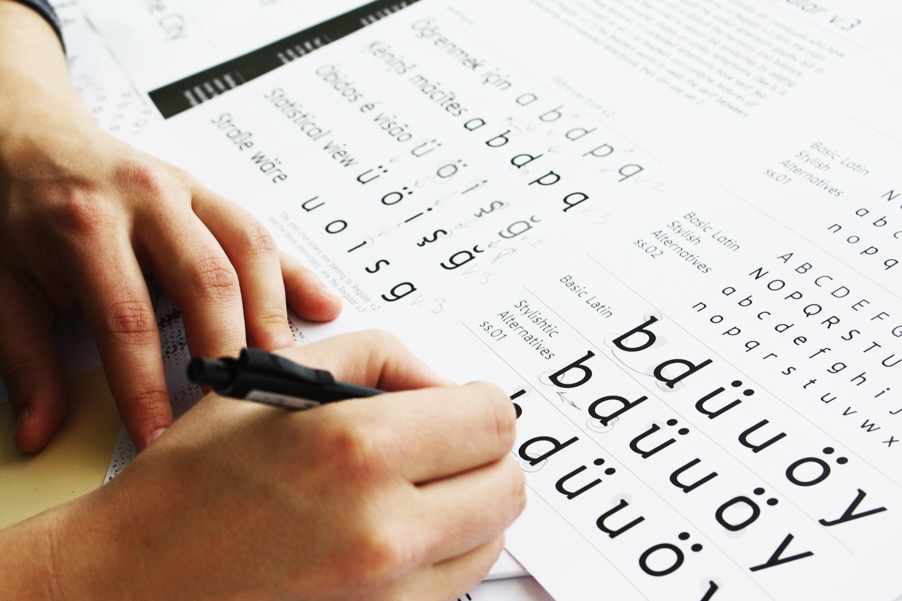
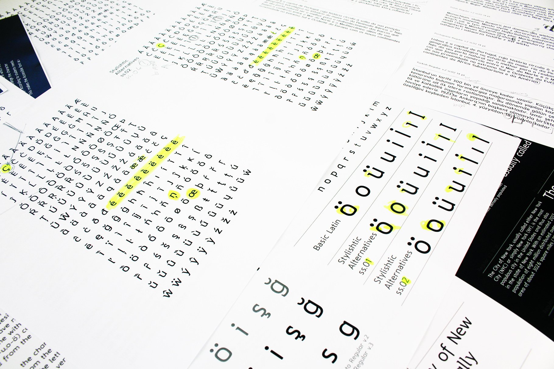
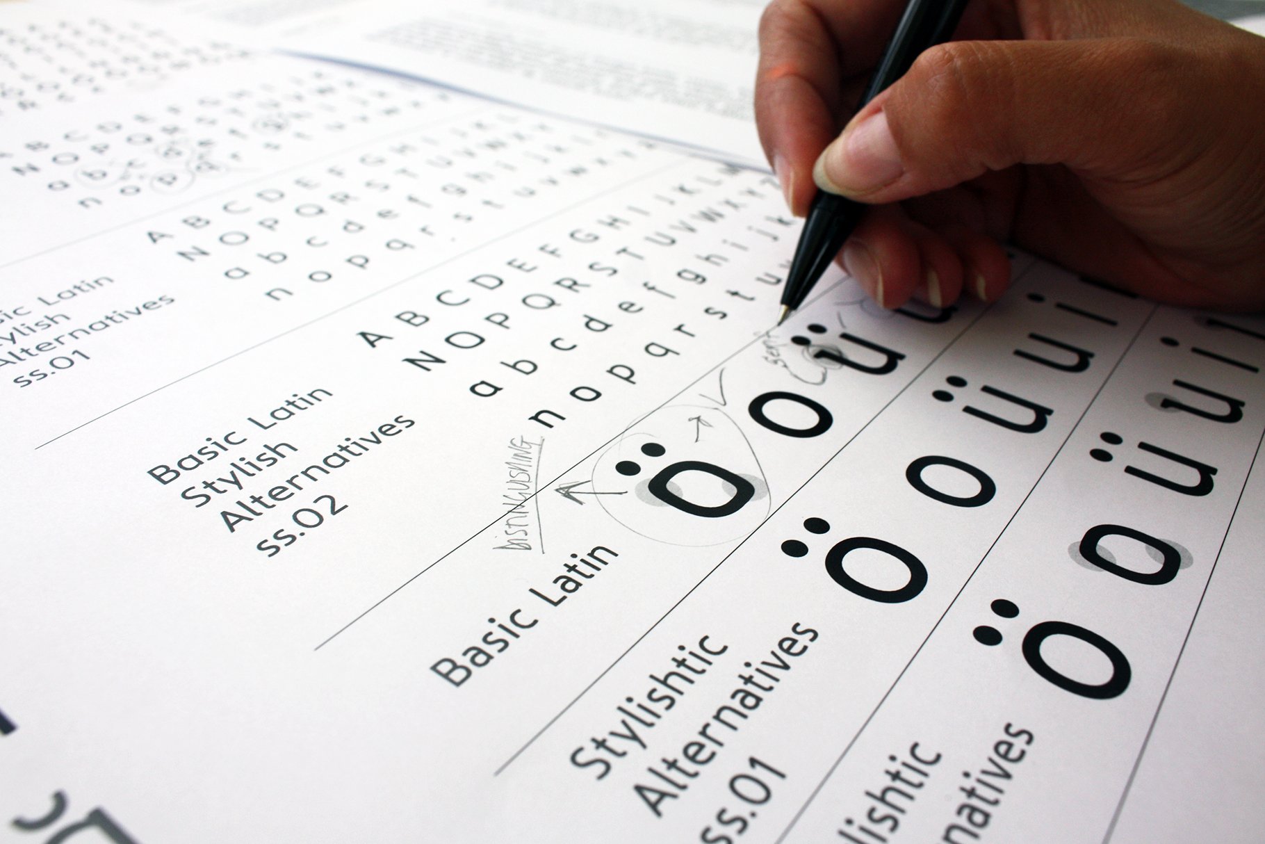
The Regular v.3 typeface was designed specifically for individuals who have difficulty in distinguishing similar letterforms. The main purpose of the design in the regular v.3 font was to design similar letters to distinguish each other. however, care was taken not to disturb the harmony and balance in the font family. It has been tried to reduce the similarities by adding serif features and different character shapes on similar letterforms (like b, d, p, q,). In addition to these features of V.3, it was added serif features to extended letterforms from V.2 and it is coded as a set 1. So teachers can combine features of Regular v.2 with Regular v.3. If the teachers want to swap the serif between basic Latin letterforms and extended letterforms, they can use set 2. Accessible typeface family was created based on the practices of the educators, typeface designers and researchers in the fields of psychology. The aim of the typeface study is to find solutions to the problems of the individuals who have difficulties in reading and the process of learning to read.
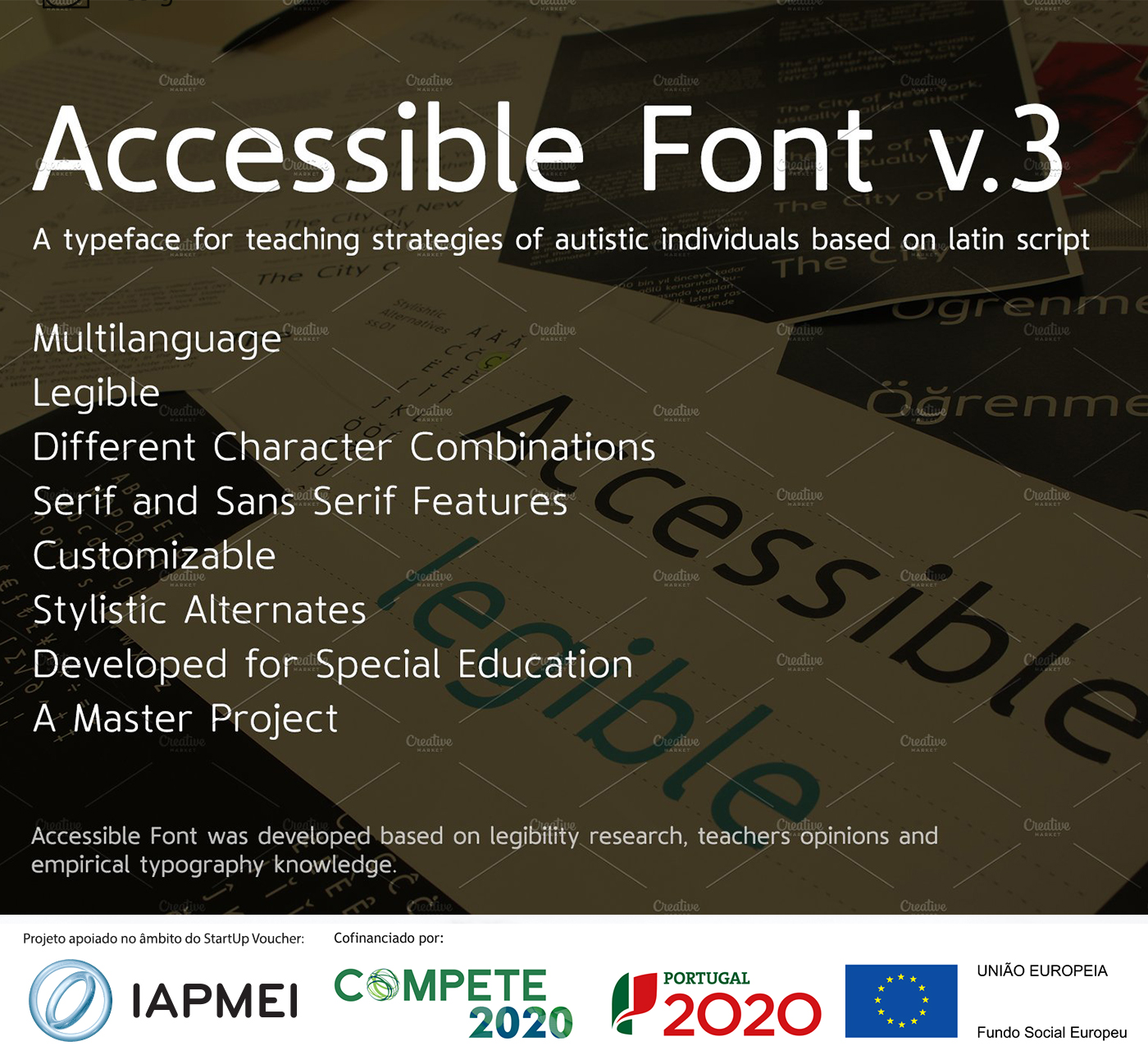
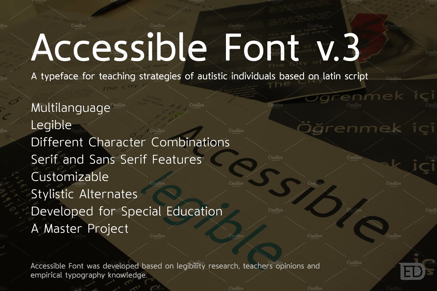
Accessible Font was designed with a large x-height, large dotes, diacritics characters, legible structure, large letter-spacing (side bearings), different letterform combinations and reducing similarities between letterforms. The Accessible stand out with extended characters that support almost 200 Latin-based languages, covering math symbols, punctuation, and currencies.
Accessible font family is a simple and harmonious appearance as well as it offers great customization support to the pedagogues with differences in letterform design and stylistic combinations. As a result, a typeface is appeared to meet the individual requirements in which the teachers can change the character design according to students needs. This makes the Accessible font accessible for everyone.



Reviews
There are no reviews yet.